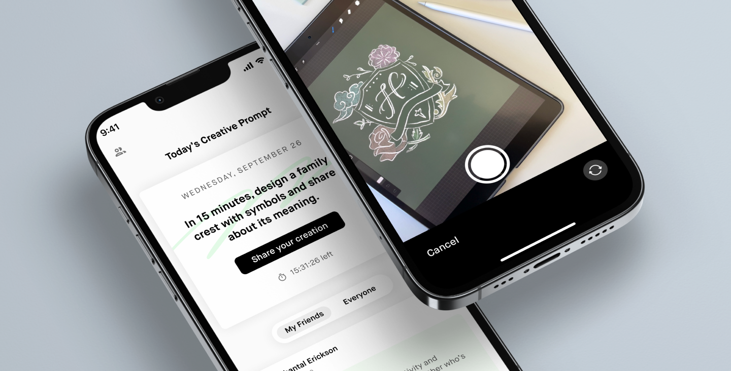
Daily Creativity Mobile App
2022 | Studio
Overview
Studio (formerly Monthly) is an online learning startup for creative pursuits such as music production, baking, creative engineering, painting and more. The company’s bread and butter is their 30-day classes, where students follow step-by-step instruction from some of the world’s best instructors, learn by doing hands-on projects, and stay accountable to their goals with a group of peers. Thus, we offer a unique model of online learning that differs from both the traditional in-person classroom experience and the Masterclass style of passive video consumption.
As things started opening up in 2022, we noticed that our users, who were mostly engaging with content on desktop during the pandemic, were showing more of a desire to learn on-the-go. People also had less time to devote to intense learning experiences, but still wanted to have fun with their creative hobbies. As a way to address these changing needs, our team designed a mobile app to encouraged bite-sized creativity and connecting with friends through daily prompts, with the intention that it would eventually evolve into a companion app to our web product.
Team:
Natalie Harmon: Lead designer
Chantal Evett: Product manager
Madeline Griswold: Engineering
Justin Poliachik: Engineering
Role:
I led the discovery stage, partnered in research, owned each design iteration, and delivered the final design specifications.
Project Background
Audience
People of any demographic that have creative hobbies, especially our past and current Studio students. This project is also aimed at serving people who have a desire to be more creative in their day-to-day lives.
Customer needs
Being creative can significantly improve our overall wellbeing, yet it’s often hard to prioritize. Especially 2 years into the pandemic, people understandably crave connection with others more than solitary pursuits, and even if they find the time, switching into the creative mindset can be difficult.
Business objective
Our goals as a team were to enable product led growth, gain the expertise needed to build and launch mobile apps at Studio, and ultimately expand the mobile experience beyond the initial creative game.
Final Designs
One creative prompt each day
Every day has a new prompt meant to spark a quick creative activity. Throughout the week there’s a mix of drawing, photography, writing, music, and crafting prompts.
Spend 15 minutes creating
When it comes to creativity, people often feel pressured to make the next Picasso painting or Taylor Swift hit. By encouraging you to only spend 15 minutes making, it takes the pressure off of perfection, enabling creative play.
Share your work with friends
Whether in the app or outside of it, you can share what you’ve made in any way you see fit. Share images, videos, and/or writing, and customize your theme.
Connect with friends in a new way
By seeing how your friends interpret the prompt, you get to learn more about them and their creative side. Share the love by commenting and reacting to what they share.
Process
Our small but mighty team of four worked on this project over the course of 4 months. We started by dreaming about how we might build out a full mobile companion app to the desktop learning product. However, after taking cues from earlier research and wanting to move quickly, we decided to test into the mobile space by designing a more lightweight game to encourage daily creativity.
Timeline & Plan
Early Explorations
This project started off with thinking about how we might create a mobile app as a companion to our web product. We saw an opportunity to optimize our learning experiences for a more on-the-go lifestyle. Though we have a mobile web experience, it’s not great for more social aspects of the class, such as getting notified about comments and reactions on your projects.
We recognized that developing a fully fledged companion app would be a non-trivial amount of work, so we decided to take a step back think about light-weight ways to test into the mobile space. We thought that this was a good opportunity to address a question that came up in our team’s research earlier this year:
How might we connect creative people and help them make the time and space to create?
Ongoing Creative Wellness Research
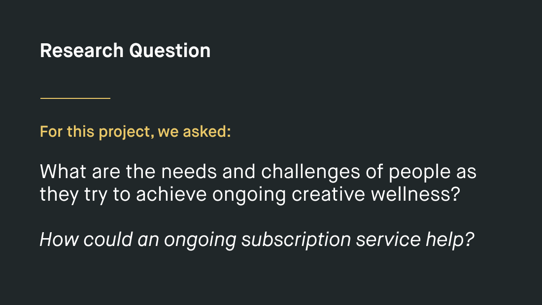
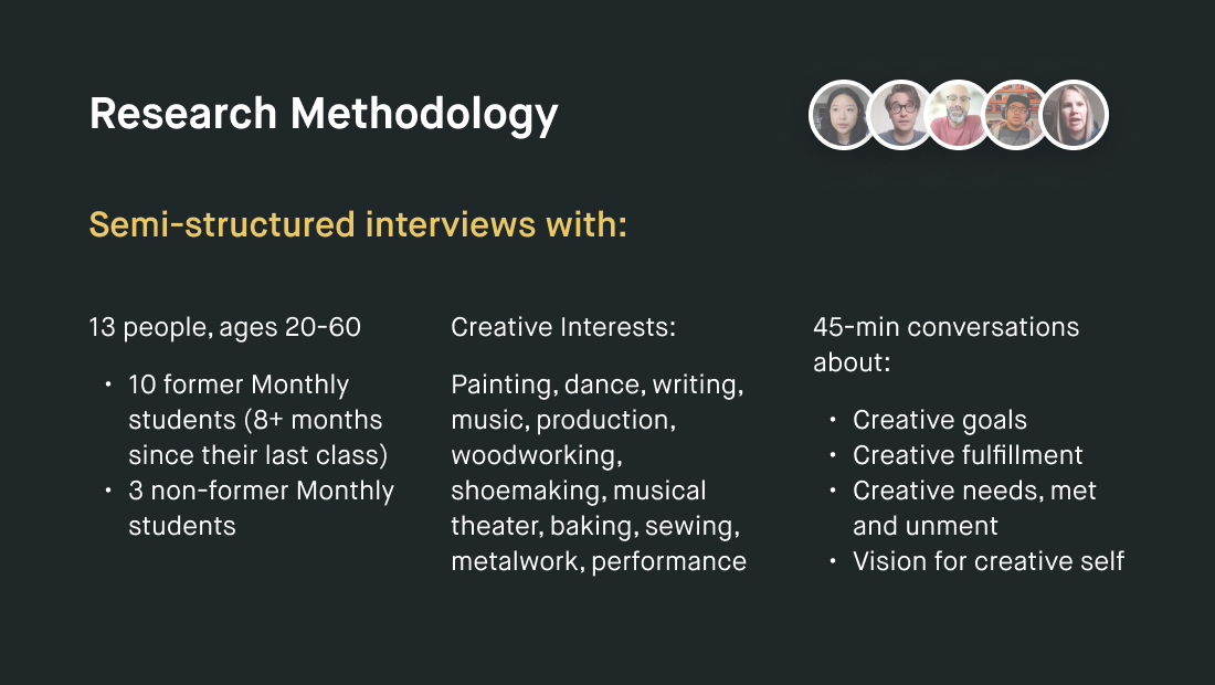
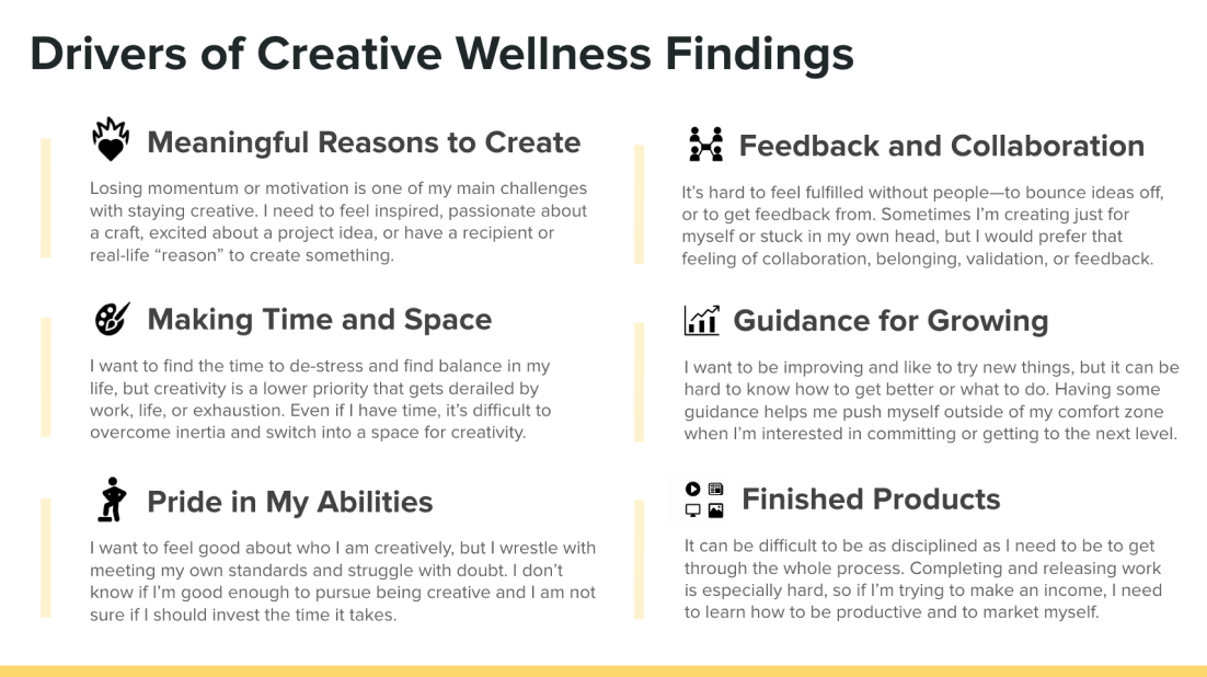
In April of 2022, our team’s UX Researcher at the time, Taylor Garland, led a study around the topic of ongoing creative wellness. Below are some of the findings. For our mobile project, we wanted to see if we could address the needs of making time & space for creativity + connecting with others.
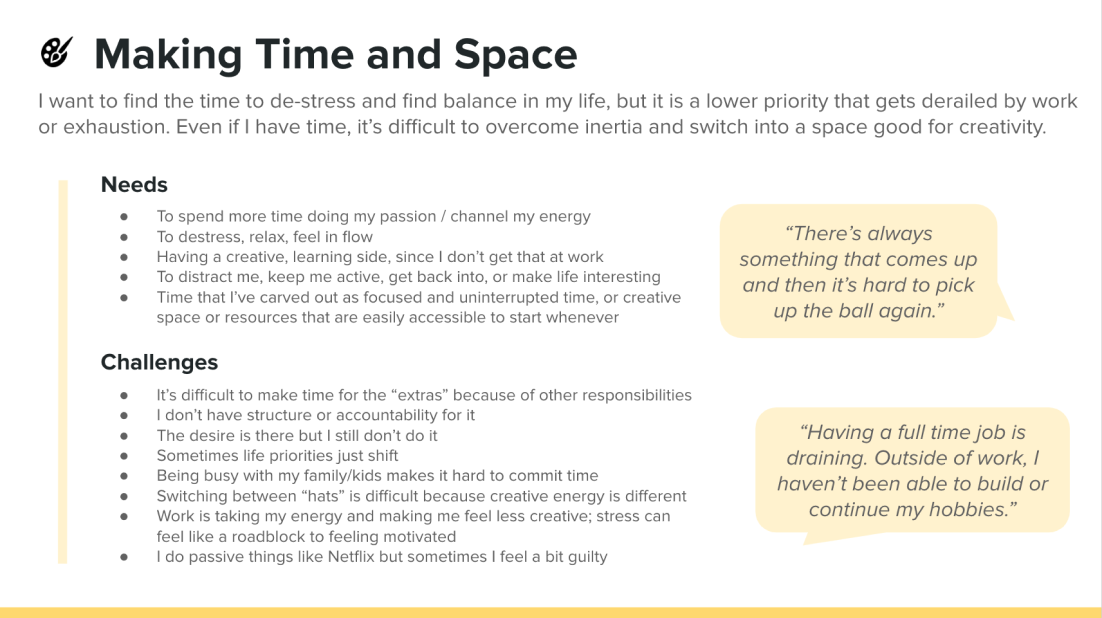
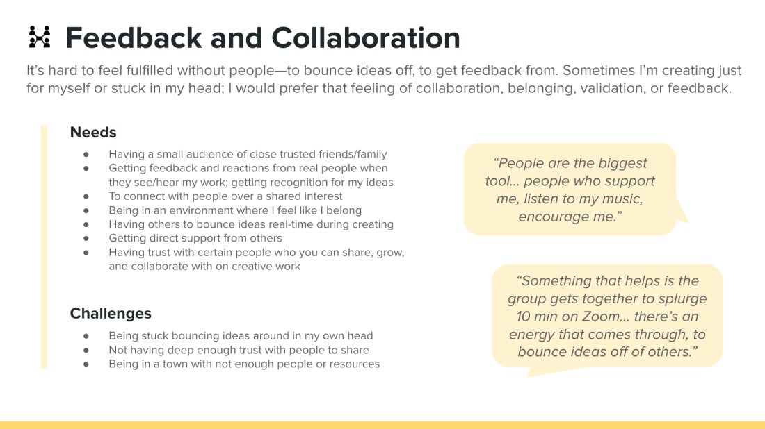
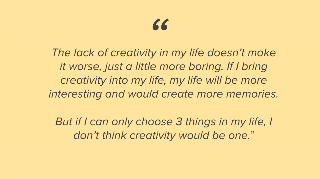

We did a bunch of blue sky explorations of what types of apps would address this question. A lot of the ideas were variations of prompts or challenges that people could do with friends. Our team is all creative in their own way and we were most excited about participating in daily prompts together. We decided to test the idea in a low-fidelity way and do design explorations in tandem.
Internal Experiment
We decided to test this idea internally with our coworkers in Slack, where we would come up with a prompt each day and post it in the mornings. We used this space to iterate and figure out which types of prompts were most motivating. For example, one thing we tried was offering people a surprise reward for having a perfect-week streak. At the end of the week, we made personalized video compilations of their work that they could easily share with others.
Learnings
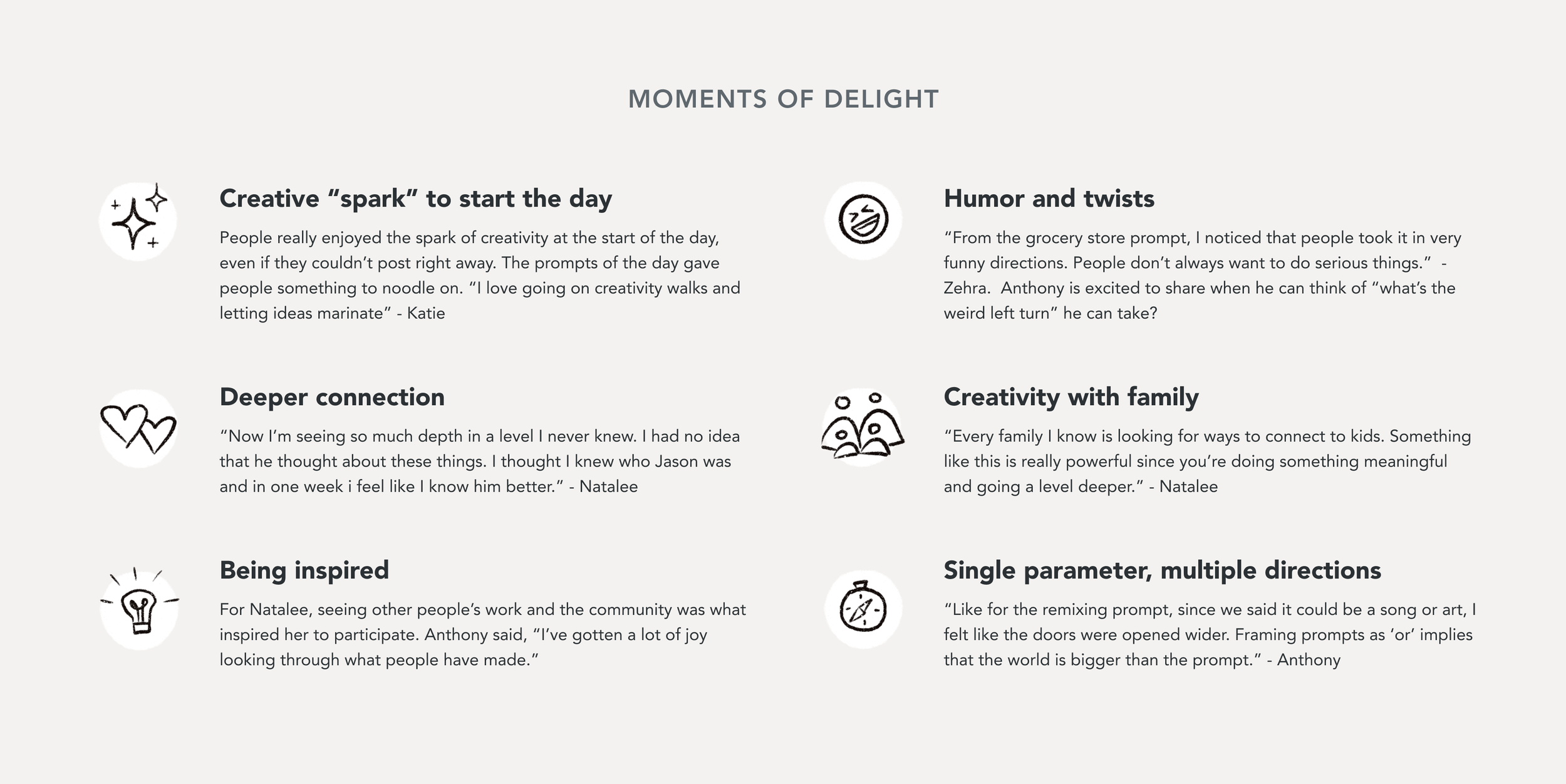
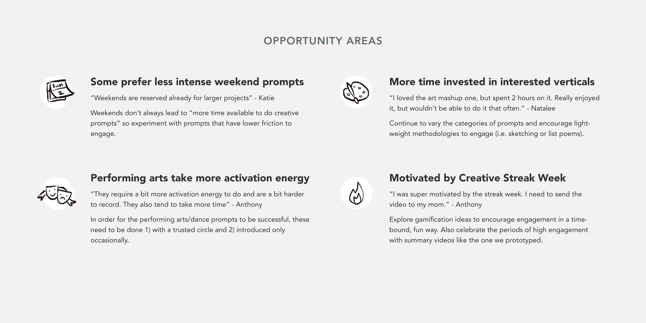
We interviewed 6 of our coworkers who participated in the Slack prompts to get their feedback. Here were some of the things we learned:
First Design Iteration
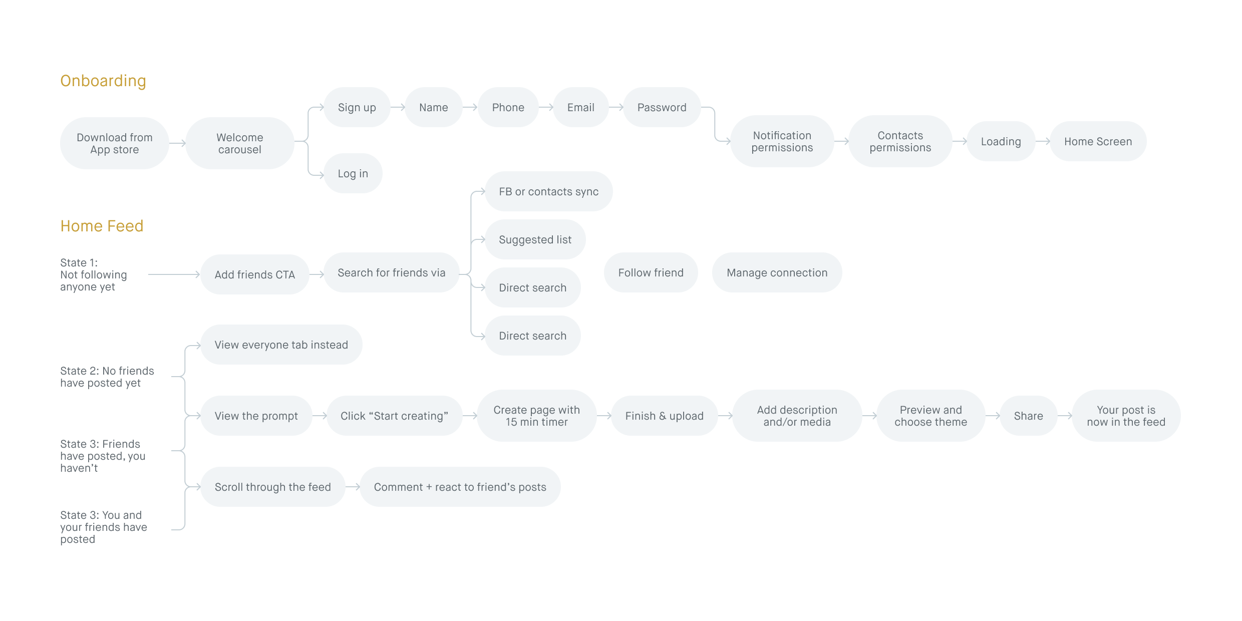
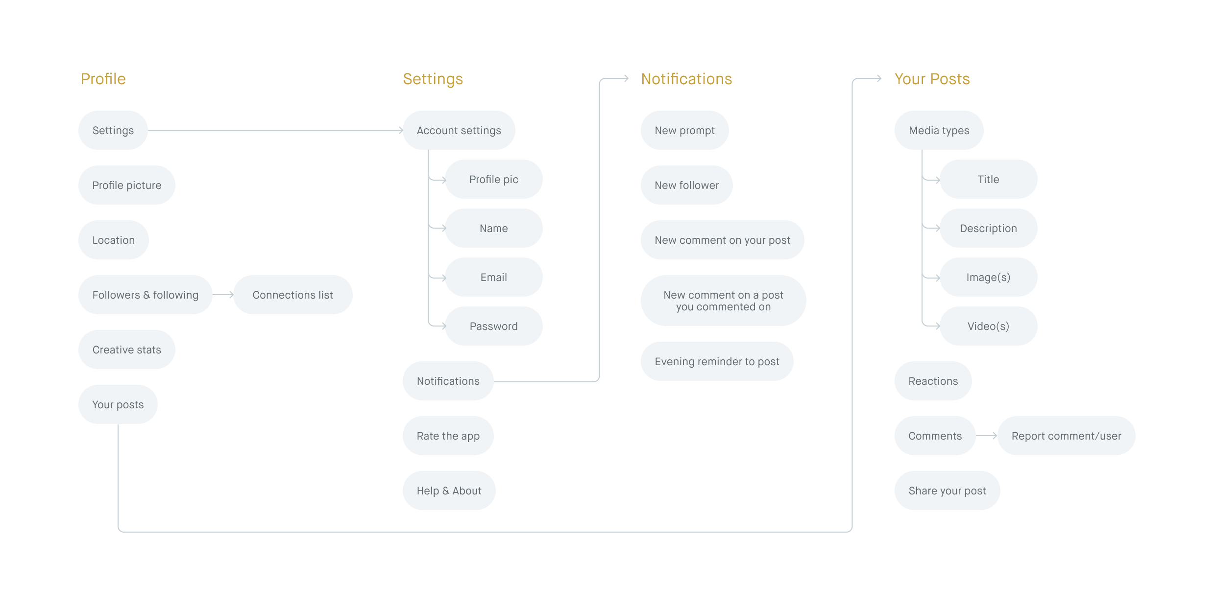
At the same time that we were testing the daily prompts in Slack, I began working on a first iteration of the app. The core concept was relatively simple: get a new creative prompt each day, work on it for no longer than 15 minutes, share it with your friends, and then see what they’ve made. I made sure to map out what screens I needed for an MVP app and used that to guide my exploration.
Our web product had this feature called Sessions where students could go into a flow state and keep track of the time they were working on their creative projects. For our first iteration we tried mirroring that functionality, thinking that it would help encourage people to stick to the suggested 15 minutes.
However, we got feedback that people would probably do their creative exercise outside of the app and that the timer wasn’t really adding value. It also was a bit jarring to transition to dark mode, even though the intention was to demarcate that an active creating session has started. So, we took out this step.
Next Iteration
For the next pass I simplified the core flow, fleshed out edge cases, added my own illustrations and refined the visual language.
Beta App Launch
After making sure that the app was working in TestFlight and fixing bugs, we launched the app the App Store as a beta. We shared it with our friends and families, and we also hosted a creativity night with mini-workshops covering activities like painting, crafting, and dancing. We used the night as a way to connect people over creativity and promote the app.
“Best use of my screen time. In the best way, this app gets me to take a break from work and social media and inspires me to use the best part of my brain.”
“This was great! It felt a little like I got to play ‘kindergarten arts & crafts’ and I don’t mean that in a bad way. It was a VERY welcoming way to just play and create.”
Results
Unfortunately, the app was live for only a month before Studio laid off a majority of the company, me included. We made the decision to pull the app from the app store since no one could maintain it, and we were never able to properly go-to-market with the app. However, even during our beta, which was only circulated by word of mouth, we had some positive results!
139
Total Sign Ups
57%
Active Creators
5 Star
App Store Rating

There were a lot of things we looked forward to doing with the mobile app! Most obviously, we were excited to share it with our past and current students, grow the user base, and properly test out our hypothesis of connecting others through creativity. I was also hoping to take another pass at the app’s visual language, experiment with different prompt formats, or even have Studio instructors host the prompts for a week. Ultimately, despite how things ended, this project was super fun to work on, and I loved seeing all the things our users made.


