
Left Navigation Redesign
2021–2022 | QuickBooks Online
Overview
The old left navigation in QuickBooks was a long list of items that wasn’t always relevant to every type of customer. When they tried to understand how the product worked and navigate around it, customers were often overwhelmed and frustrated that they can’t find what they need. With all the new innovations and features being added to QuickBooks, the old left navigation structure was not scaling well to accommodate such growth.
Over 6 months, our team took on this massive challenge which touched almost all product areas of QuickBooks. We went through multiple rounds of user testing and design iterations to propose a new information architecture, which cut down the original length by 50%. In addition to reducing complexity for our users, we reorganized the new navigation to help our customers run all parts of their business, not just their bookkeeping. For those who want to customize their navigation further, we introduced the ability to bookmark important pages, hide items that aren’t relevant to them, and reorder the navigation to suit their needs.
The new customizable left navigation became available to customers in the summer of 2022.
Team:
Natalie Harmon: Lead designer
Chantal Evett & Nathan Belaye: Product managers
James Theisen: Content design
Pandora Platform Team: Engineering
Role:
I led the discovery stage, ran customer research, owned each design iteration, and delivered the final design specifications.
Project Background
Customer Problem
Small business owners want to get things done and understand how their business is doing within QuickBooks. However, they often can’t find what they need because the left navigation has too many things, things they don’t need, and things in the wrong place, which leaves them feeling lost and annoyed.
Audience
Business owners who don’t have much accounting or bookkeeping experience and are signing up for QuickBooks Online for the first time. Theses are customers who would view the product in Business view (as opposed to Accountant view)
Team objective
Redefine the current QuickBooks left navigation information architecture in order to lay the foundation for a navigation that is personalized for our customers, is configurable for their unique needs, and can grow with their business.
From: An overwhelming skyscraper of items that isn’t relevant to everyone
To: A simplified and customizable left navigation that can can meet anyone’s needs

Deeper nesting within more intuitive categories
The old left navigation was a long list of over 20 items that was hard to scan. The new design moves away from the flat hierarchical organization, to a more scalable hub and spoke structure.

Bookmark the pages you use the most
For the pages that you want quick access to, you can add them to your primary menu as a bookmark. Then you can save yourself an extra click.
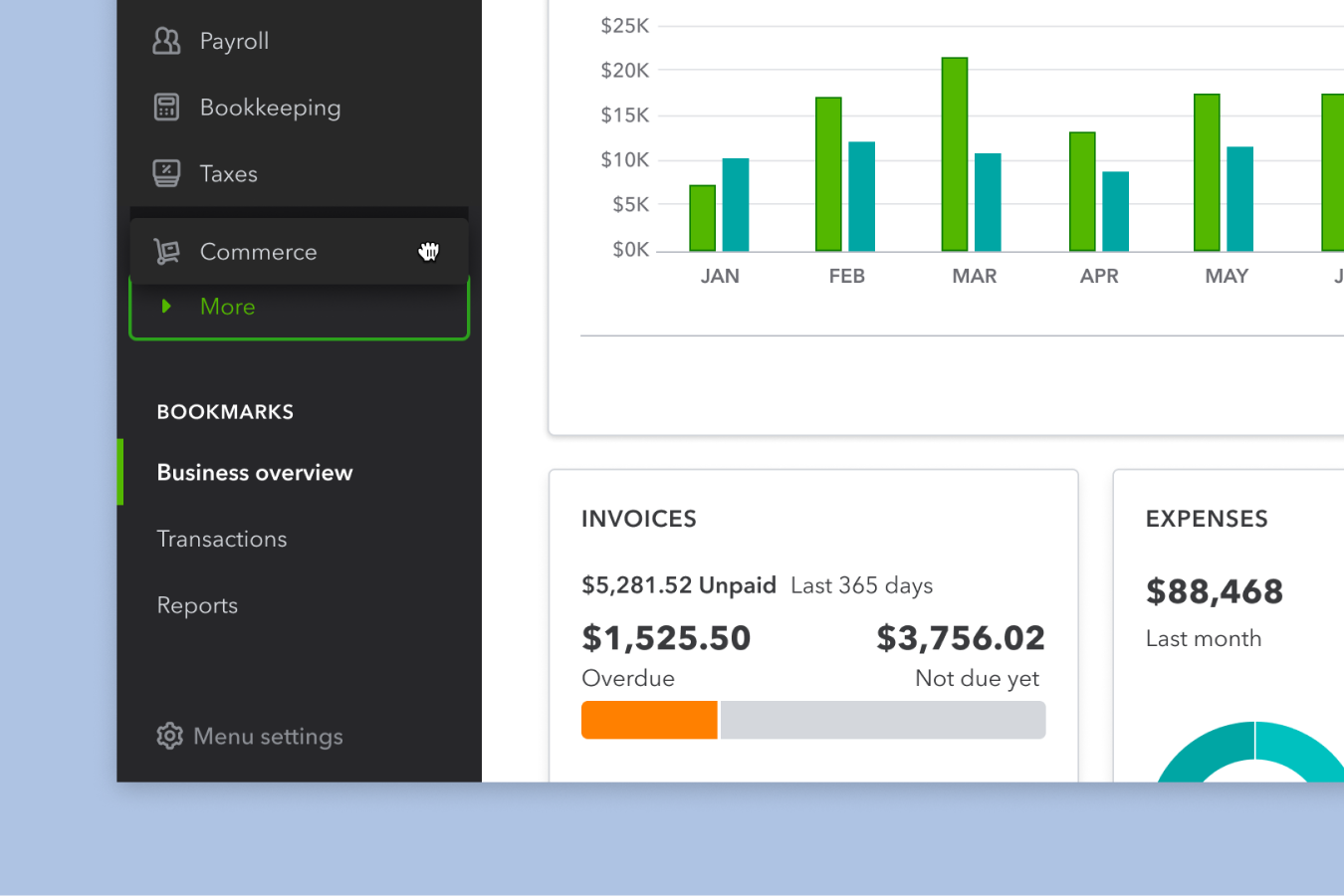
Hide what isn’t relevant to you
Drag items that you don’t want to see in your primary menu under More. It’ll still be there if you need it in the future.

Fine tune your preferences
In addition to customizing directly from the menu, you can also configure everything at once in the menu settings.
Process
This project was a massive undertaking that involved many stakeholders and lots of research. Given that navigation has an impact on the whole product, we made sure to involve as many teams as possible and share our progress throughout the entire journey. We also tried to take a customer backed approach to the redesign, leaning heavily on research and data to make design decisions.
Project timeline
How a customer can feel when starting off with QuickBooks
-
![]()
1.
Imagine that you just recently started a small business. It’s an exciting time, but you’re probably pretty stressed and trying to learn a bunch of things to get you started.
Feeling: Excited, stressed
-
![]()
2.
Once you start making some sales, you want to get software to help run your business and organize your books. You’ve heard about QuickBooks and are hopeful that it can meet your needs.
Feeling: Hopeful
-
![]()
3.
When trying to pick which QuickBooks plan is best for your business, you’re confused by the choices. You’re not very familiar with bookkeeping/ accounting, but you want to make sure you don’t make a mistake so you can stay compliant
Feeling: Unsure, confused
-
![]()
4.
Once you make a choice and log into QuickBooks for the first time, you’re not sure where to get started. You see a super long left menu and see things you don’t even need. Maybe QuickBooks is too complicated for you?
Feeling: Doubtful, overwhelmed
-
![]()
5.
It’s too overwhelming to start using QuickBooks today and it’s not as simple as you were expecting. So, you log off and decide to try another day. Or maybe you’ll look into another accounting solution that better meets your needs.
Feeling: Defeated, disappointed


QuickBooks keeps growing, and so does the ‘skyscraper’ of left nav items
Customers consistently ask for the ability to customize their left menu since not everything fits their needs. Instead, in the past, when a new feature is added to QuickBooks, it gets added to an ever growing list. Access points in left navigation historically outperform all other access point in terms of discoverability and clicks, so there has been a long history of failed attempts at governance and “escalations” as a tool to gain prominence.
Step 1: Aligning on the problem
Given all the challenges we were facing as a navigation team, I decided to put together a design sprint. The goal was to dive into QuickBooks’s key navigation challenges with a diverse team and create three design provocations for us to test with customers and share with leadership.

Sprint plan
Day 1: Diving into the problem
Day 2: Inspiration show and tell
Day 3: Sketching
Day 4: Narrowing
Day 5: Personas
Day 6: Concept development
Day 7: Concept dev. cont.
Day 8: Wrap up and next steps
Outcome: three different provocations and a lot more questions than we initially started out with.
What all ideas had in common was moving from a two-levels deep structure to one with deeper nesting, more similar to a hub & spoke model.
We learned that navigation is much more complicated than we thought, that our current information architecture is not scalable or sustainable, and that there’s a big opportunity to improve it for our customers and business.
We needed a lot more time and resources in order to tackle this problem the right way. After pitching this as a project idea to the head of design at QuickBooks, we got the green light to kick this off as an official project
Step 2: Learning & discovery
We went through multiple rounds of research to learn about customer mental models and figure out the right information architecture. To be successful it needed to strike the right balance between simplicity and findability.
Research methods
-
![]()
1. Open card sort
Goal: To learn about how participants group and associate our left nav items naturally without any prompted categories.
Learnings: Participants made an average of 6 categories, had different ways of thinking about money-in features, and didn’t need every QuickBooks feature.
-
![]()
2. Information architecture variants
Based off of the initial card sort and other inputs, we created four different information architecture variants which we named Apps, Money In/Money Out, Transactions, and Relationships.
-
![]()
3. Closed card sort with 100 participants
Goal: Understand how customers associate different pages and features in QuickBooks with predefined level 1 “centers” across 4 different variants.
Learnings: (1) The least confusing labels were in the MIMO & Transactions variants. (2) Transactions and MIMO stand out for having the most card alignment overall. (3) Confusing terms include: Money, Experts, Relationships, Resiliency
-
![]()
4. Concept testing with 7 participants
Goal: To test if the hub and spoke model is easy to navigate and if the organization matches participants’ mental models
Learnings: (1) Less level 1 items is less overwhelming, but takes a while to learn. (2) Irrelevant nav items get in the way, and there’s a desire for customization. (3) No red flags that simplifying the left nav and creating nested pages was perceived as overly complex or confusing.
-
![]()
5. Tree testing with 600+ participants
Goal: For round 1, test 3 new IA variants to measure findability of features in the context of task completion. For round 2, test the winning variant with participants across multiple cohorts to confirm it’s scalability.
Outcome: The winning variant was one called Actions!


UI Explorations
-
![]()
Idea 1: Back button
Pros: (1) Everything is laid out at once, don’t need an extra click. (2) Gives us extra page space to move away from tabs
Cons: (1) So many fonts and words. makes it look really cluttered (2) Could get long
-
![]()
Idea 2: Flyouts
Pros: (1) Less visual clutter on left nav (2) Similar to how the current nav behaves
Cons: (1) Extra click to get to L3 (2) Lots of duplicate naming (3) Hovering is less accessible (4) These flyouts have been buggy sometimes
-
![]()
Idea 3: Accordions
Pros: (1) Other L1s are still accessible if you want to click them
Cons: (1) Could introduce more scrolling (2) Harder to differentiate hover and selected states (3) Run out of character length space with nesting
-
![]()
Idea 4: Hamburger overlay
Pros: (1) Behavior is more similar to competitors like Square (2) Cleaner typographically than Idea 1
Cons: (1) Have to figure out how to better collapse the menu (2) Logo would only be on the home nav (3) Might be more effort to build
-
![]()
Idea 5: Mini nav
Pros: (1) L1s are always accessible through the skinny nav (2) Visually friendly
Cons: (1) Icons aren’t always accessible, people have to hover to see what they mean (2) Might require more effort to build


Step 3: Refinement

Leading IA Variant
The Action variant had a higher task success rate than all the others and the control (our current navigation). Because the nesting took longer to learn, it had a slightly lower directness score.

IA Framework
Our recipe for transforming navigation to default into an ecosystem of services, tools, and insights that power running a business.

Current navigation vs. proposal
The new structure cuts down the “skyscraper” by 50% and puts centers in a more logical order that’s focused on helping small businesses run their business.

New Navigation Information Architecture
The new structure has less level 1 centers but more depth/nesting. No pages were gotten rid of or created, just shuffled under new categories.

Winning UI Treatment: Mini Nav
We narrowed in on the mini nav interaction using a set of principles and by consolidating learnings from user testing sessions, feedback from our design system, and internal reviews. With this design, the level 1 centers are always visible/available, and it overall had a very friendly look.
Final Specs
-
![]()
Prototype
I recreated QuickBooks in a Figma prototype with the new navigation designs so that people could visualize how it would behave in the new nav. We used this for concept testing and internal storytelling.
-
![]()
Detailed specs
Since the navigation is visible from most parts of the product and is an important part of our design system, I made sure to care about all the details.
-
![]()
Accessibility
I made sure that the color contrasts passed WCAG Guidelines and documented the tabbing order for keyboard navigation.
-
![]()
Responsiveness
For our experiment, we were launching for web, so I needed to make sure that the nav would still work on phone and tablet browsers.
-
![]()
Motion
Motion is an important part of showing the transitions between the primary and secondary navigation.


Step 4: New navigation experiment
Test plan: After signing up for QBO AND self identifying as owner & employee, 50% of users are randomly assigned into control experience and the remaining 50% will be assigned into the test bucket. (Variant A: Control; Variant B: New Left Nav)
Primary metric: Increase the % of companies that start a task.
Results: Overall, we did no significant harm and saw some positive trends in our secondary metrics
-
50% reduction
In L1 navigation items. This was a big success!
-
No harm
To task starts, despite deeper nesting
-
Improved engagement
In QuickBooks Cash signups, Capital applications, and Payments signups
-
3% increase
In QuickBooks Online trial conversion
Step 5: Customization
It was a huge success to decrease the left nav skyscraper, but it’s still a one-size-fits-none experience. In order to meet our customers needs, we have to allow them to configure the navigation how they wish. We did a few rounds of concept testing to identify which customization capabilities would be most valuable.
This functionality is foundational for QuickBooks to move towards a more personalized future where the product can exactly match customers’ unique needs.
Ways to customize:
-
Customers were most excited about bookmarks and having quick access to pages that they use the most. We want to allow them to bookmark pages in the moment when they want to save a page and from an edit mode for when they’re in more of a planning mindset.
-
It’s super important to let people hide the items that they don’t need and that are cluttering up their nav. Then they can focus on what matters most to them.
-
Reordering items is less valuable, but still an important and expected capability that will help customers prioritize what’s most important to them.
Launching the New Navigation
This new, customizable left navigation was launched to Business View users during the summer of 2022. I transitioned jobs before seeing the final designs go into production, but most of what was ultimately shipped it is true to my initial designs. Here are some resources introducing the new menu.


Reflections
-
There’s no such thing as over communicating
Since this was such a major project that had impact on almost all parts of the organization, we made sure to share our progress often. We wanted to minimize last-mile blockers as much as possible.
-
A win-together attitude overcomes political tensions
Instead of doing our work in a silo and dictating our decisions to other teams, we spent our time to listen to their needs, treat them as collaborators/ partners, and leverage their expertise.
-
Be customer obsessed!
Throughout the whole process of the project, we made sure to test with customers at every step. For such a major change, it was crucial to make customer-backed design decisions
-
Show, don’t tell
I learned a lot about how to visualize complex ideas and also realized how valuable prototyping is as a storytelling tool. It’s one thing to talk through changes and another to interact with them yourself.