
Pebble
Color & Communication | Fall 2015
Overview
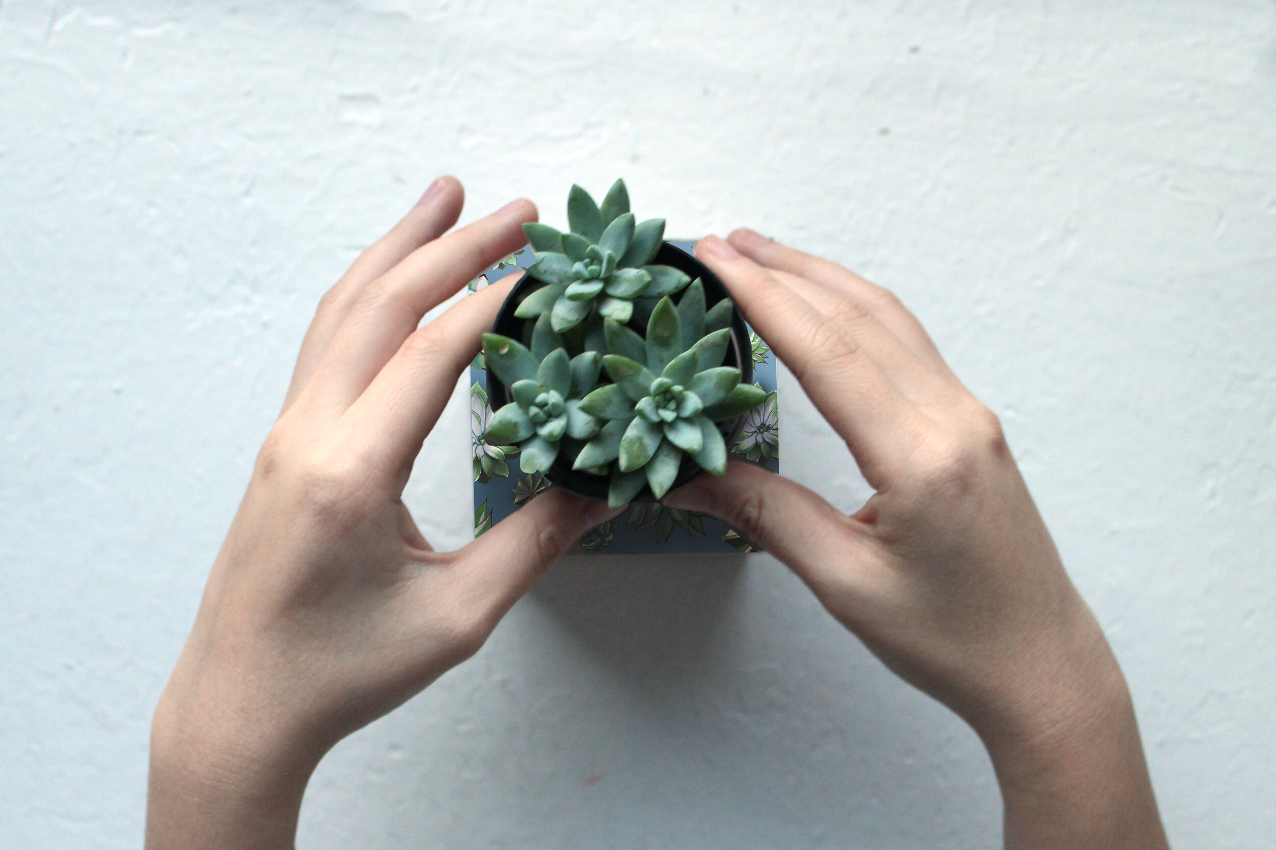
This is a project that focused primarily on color interaction. It is the branding and identity for a plant shop. My idea was to create materials for a store that sold succulents, but also was a cafe. For the design, I wanted the warm colors to represent the hot and dry environment that succulents grow in, but also to be warm and welcoming. With the cool colors I wanted to convey refreshment, life, and a sense of calm. I hand illustrated the succulents and used my drawings as graphic elements for my poster, post cards, and succulent pot.

Process
I started with a very formal, radially symmetric piece because I wanted the voice of the branding to be mature and modern, with energy coming from the hand drawn elements. I was interested in having them in a kaleidoscope pattern to highlight the circular frame. Since my fictional cafe would host plants, food, and beverages, all of which are in circular/cylindrical containers, I wanted circles to be a primary element. In time though, I realized that the kaleidoscope arrangement was a bit rigid and stiff, and I realized that I wanted to create a more fun and inviting visual identity. So, I experimented with brighter colors rather than the muted ones I was using and arranged the succulents in a more unpredictable way.