Omada Health Website Refresh
Summer 2018 | Omada Health Internship, San Francisco
Overview
As said on their website, Omada is “a digital care program that empowers people to achieve their health goals through sustainable lifestyle change.” They provide programs for prevention, type 2 diabetes, hypertension, and behavioral health that help participants form healthy habits that last.
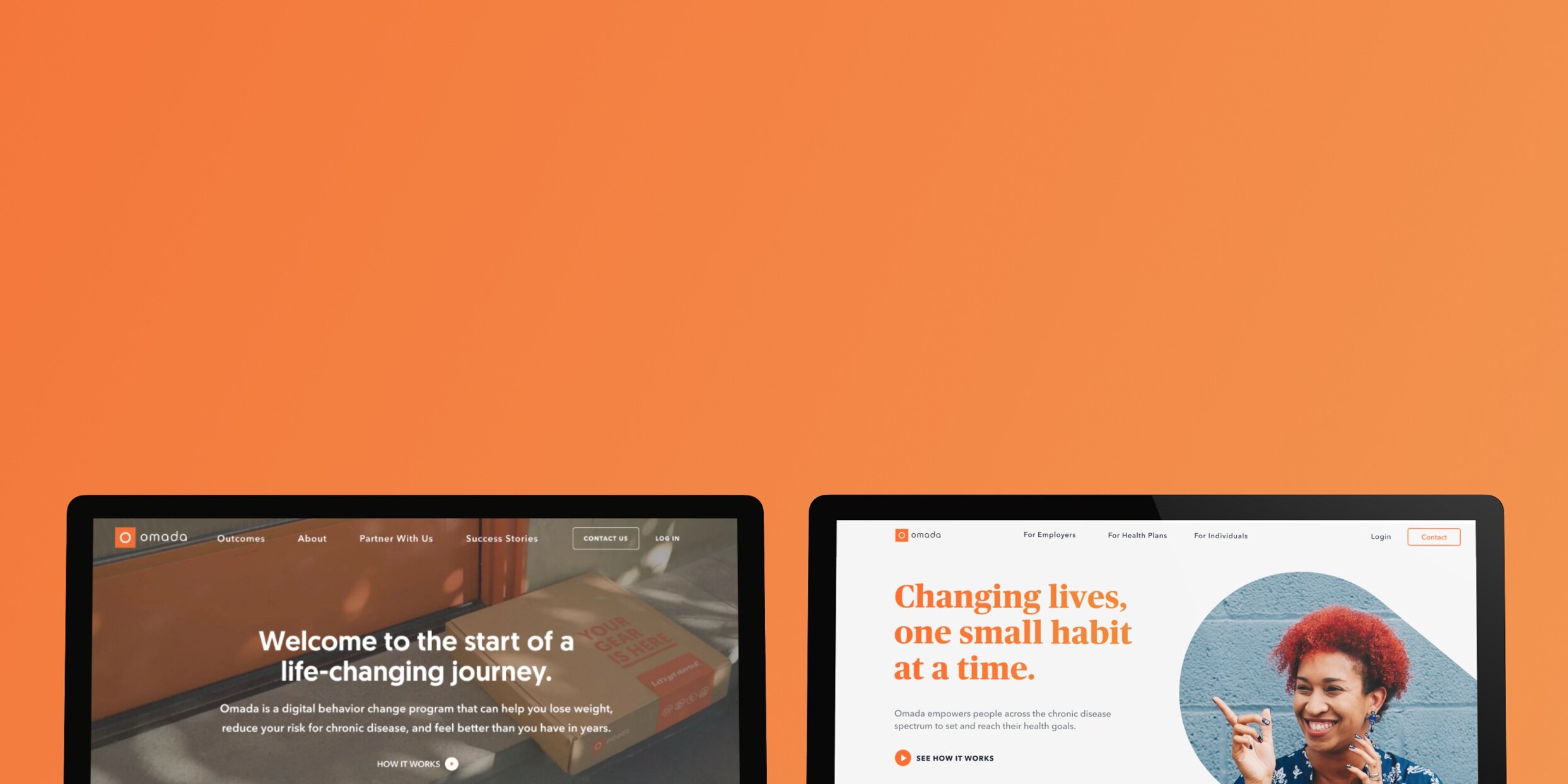
I was a visual design intern here in the summer of 2018, and it was a blast! One of the projects I worked on was this: a redesign of the Omada website to better reflect their brand and better speak to the different audiences coming to the site. At the time, the website was very tailored towards the participant experience and B2B information for employers and health plans was hidden in other pages. In order to help the different site visitors find the most relevant information, we redesigned the landing, for employers, and for health plan pages.
Note: Since I was an intern Omada has gone through another visual refresh. You can learn more about them and see the current site here at omadahealth.com.
Team:
Lauren Zalman: Product Management
Patrick Weiss: Creative Direction
Eli Myers: Web design lead
Natalie Harmon: Web design
Laura Moore: Content
Lesly Chan: Research
Project Background
Problem
Based on previous research and anecdotal feedback, the website did not provide a clear direction to B2B prospects as to where to find introductory information about the Omada program, cost details, and other audience value-based content.
Goal
(1) Clarify where site viewers should navigate to find information relevant to them, (2) update information to reflect latest product features, recognition, certifications, and outcomes, and (3) update visuals to best represent Omada’s brand
Audience + Scope
The intended audience were prospective health plan buyers and prospective employer/benefits buyers. In scope for the project was a new home page, segmented pages for each audience, and design/content improvements.
Before: A website that was focused mainly on the participant experience.
After: Easily to find content that’s tailored to different types of viewers
We designed two new pages to speak directly to employers and health plans considering Omada. The top navigation was changed to be for each of the different types of visitor, and each page would explain the program in a way that was relevant to them.
Showcasing updated program features
Another goal was to more clearly explain what the Omada program consists of and which conditions we support, so we designed some interactive sections for people to dive deeper into.
Explaining the benefits of Omada for each audience
We used a line illustration style to add some personality to the website and to illustrate the benefits that Omada brings not just to participants, but also to employers and health plans.
Doubled Enrollment
Omada-led marketing campaigns enroll 2X the participants compared to client-led campaigns.

Exceptional Engagement
On average, participants proactively interact with the program 31+ times per week, or nearly 4.5 times per day.

Meaningful Results
Omada’s peer-reviewed studies demonstrated that study participants lost 4-5% of their body weight on average at 1 year.
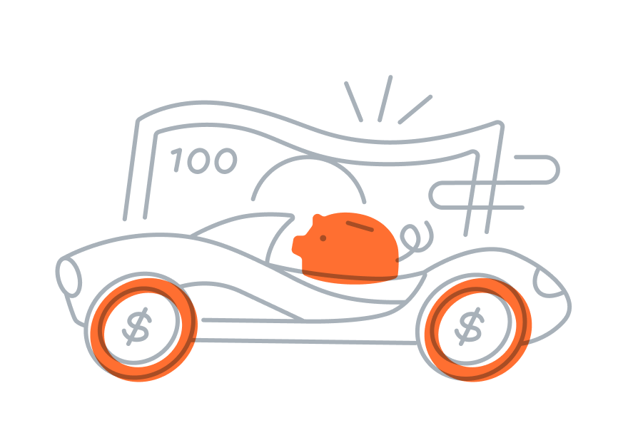
Accelerated ROI
Employers have realized cost savings from health claims in as little as 1 year.
Building trust with social proof
We made sure to include testimonials from participants, employers, and health plans to showcase Omada’s outcomes.
Showcasing clinical outcomes
Omada’s credibility is also boosted by their CDC recognition, partnership with other health organizations and numerous peer-reviewed studies.

Process
Our process was focused around testing three different brand directions, narrowing in on one that best fit Omada and resonated with customers, and refining the visual identity. When we were looking at the websites of competitors and other brands for inspiration we noticed a few themes. Some were very whimsical and friendly, others were more academic and informative, and others were more professional and timeless. Our initial explorations were influenced by similar buckets.
To start we did design and content exploration in three different “voices” which we named Human First, Friendly Science, and Trusted Expert.
Early explorations
At the beginning of our process I sketched different illustration and icon styles. I also did web page explorations for the Human First and Trusted Expert brand voices.
Tested three brand voices
Human First
This approach was meant to highlight people and their stories. Visually, we wanted it to be more photography heavy and for content, we wanted it to be more down to earth.
Friendly Science
The goal of this direction was to convey the science and facts behind the program in a fun and whimsical way. This approach focused more on facts and numbers, but visually it was bright and airy.
Trusted Expert
The trusted expert explorations were more about establishing credibility by looking professional. Visually it was a lot more polished and serious. The messaging was also more matter of fact.
From left to right: Human first, Friendly science, Trusted Expert
Winning concept: a little bit of everything!
Now: time to refine the details.
We tested these concepts with 6 people to get their thoughts on which visual treatment and content best resonated with them. After synthesizing feedback, we saw that people overall liked Friendly Science most, but they thought the language used in the Human First concept worked best, and they enjoyed the sleekness of the Trusted Expert designs. So, moving forward, we narrowed towards a design that combined all of those concepts.

Hero image explorations
After getting feedback, I explored different image treatments and visual styles. We wanted to keep things modern and energetic, while also feeling trustworthy and capable.

Illustrations
I also created illustrations to add another visual element besides photography to the web pages. We ended up going with a vector line style that had an overlapping punch of orange.

Finalizing styles
We did a lot of explorations on what colors and fonts to use. We narrowed in on using the Omada orange and a more royal blue. For type, we decided to use a serif to add a bit of whimsy and professionalism.

Making it mobile friendly
We made sure that all of our layouts would also work on mobile web. Throughout the process we designed them side by side and documented the different spacing rules and type sizes.
Final thoughts
This project was super fun to work on because it was my first time seeing the whole web design process! I was super grateful to be able to participate in the project and help influence the end product. It was also really neat to hear from real people about what their perceptions of the brand was and to tailor our messaging to them. I learned a lot about what it takes to develop a visual system to make sure all pages feel cohesive together. Special thanks to Eli and Patrick for their mentorship that summer!
As I mentioned, the Omada site has since been redesigned, and the company has grown a lot. Since my internship they have gone through at least 3 more rounds of funding, acquired a company, and expanded their offerings. See the team’s awesome work over at omada.com